Ragnarok's art projects

Meaningful discussion outside of the potato gun realm. Projects, theories, current events. Non-productive discussion will be locked.
THUNDERLORD
Sergeant 3
Sergeant 3
Posts: 1264
Joined: Fri Mar 28, 2008 1:42 pm

Tue Jul 07, 2009 11:04 pm

That makes sense Ragnarok.
IMO, probably the reason for all the "T&A" in "X-Men" (for example)
is the non-access to other pornographic material for younger males.
I have a few older comics I recently priced and noticed all the "T&A" trend in them (over-exagerated female physiques, which now appear silly)

Hadn't really noticed when I was younger...Really sort of distasteful now though.

BTW, I thought that some of my comics from before I was born (30+ years old) would be more valuable,
but they're only fetching about 2-3 times face value...still not a bad investment...
But my "Ghost Rider Vs. The Punisher" volume was much less valuable than I expected, especially since BOTH have been made into movies...
I prefer to just keep that one.

Well, I hope you update us on your art as it progresses.
If any becomes a comic book character(etc.), I'll surely buy a copy myself. :wink: 8)
-----SPEED,STRENGTH, AND ACCURACY.-----
"Procrastination" is five syllables for "Sloth".
Theopia 8)
Born To Be Alive!
User avatar
Ragnarok
Captain
Captain
Posts: 5401
Joined: Tue Dec 19, 2006 8:23 am
Location: The UK

Wed Jul 08, 2009 6:14 pm

THUNDERLORD wrote:Well, I hope you update us on your art as it progresses.
That would be the point of this thread, telling you about my latest scrawling.
I'll keep the thread updated with links as and when they come into existence.
If any becomes a comic book character(etc.), I'll surely buy a copy myself.
I have considered the possibility of actually starting a webcomic of some form.
However, I would both have to become much more efficient at drawing to make that possible, and believe there was a point in it.

More fantastically, I do sometimes muse about my characters as the subjects of video games or films. It's never going to happen, but I can dream.
Does that thing kinda look like a big cat to you?
User avatar
Moonbogg
Staff Sergeant 3
Staff Sergeant 3
United States of America
Posts: 1734
Joined: Mon Oct 13, 2008 10:20 pm
Location: SoCal
Has thanked: 163 times
Been thanked: 100 times

Wed Jul 08, 2009 7:45 pm

Just thought i'd share a few of my old drawings as well here.


scratch art
Image

pencil sketch
Image

pencil sketch
Image
User avatar
pizlo
Corporal 3
Corporal 3
Posts: 783
Joined: Fri Dec 22, 2006 7:27 pm
Contact:

Wed Jul 08, 2009 8:27 pm

W O W, moonbog those are incredible
User avatar
Ragnarok
Captain
Captain
Posts: 5401
Joined: Tue Dec 19, 2006 8:23 am
Location: The UK

Wed Jul 08, 2009 9:28 pm

Agreed, it's work showing excellent observational skill and hand-eye coordination.

But you'll have to excuse me moving into critique mode... provided only in the interests of giving helpful advice.
The sketches do have a problem common to many realistic pencil portraits, because the image contrast is very low - the lights aren't very light, and the darks aren't deep enough.
Some of this is probably the camera, but basically, it needs deeper blacks - what is known as pushing the darks on art forums. Pencil can give surprisingly dark tones when coerced into it.

Bear in mind, this is not me trying to put your technique down - indeed, it's a mistake I'm easily prone to making if not paying attention.

To demonstrate what I mean, I've taken the liberty* of turning the contrast up (and whitening the background) on the picture of the elderly gentleman in Photoshop:
*If you've got a problem, tell me, and it'll be gone as soon as I get back.
Image

As is (hopefully) evident, the deeper range of contrast in the edited image immediately helps add more life to the work, without any changes to the actual composition.
It's still an example of brilliant work unedited, but use of more of the contrast range certainly wouldn't hurt it.

And yes, before you ask, given my occasional tendency to fail to "push the darks" in portraits (as I mentioned above), I do generally just do what I did here and tweaking it in Photoshop.
Does that thing kinda look like a big cat to you?
User avatar
pizlo
Corporal 3
Corporal 3
Posts: 783
Joined: Fri Dec 22, 2006 7:27 pm
Contact:

Wed Jul 08, 2009 9:56 pm

Eh, it takes away something the original has...
User avatar
Ragnarok
Captain
Captain
Posts: 5401
Joined: Tue Dec 19, 2006 8:23 am
Location: The UK

Thu Jul 09, 2009 4:35 am

@ pizlo: Art is of course viewed subjectively by each viewer. What you like and what I like are going to be quite different.
However, if going towards realistic representations, higher contrast is generally (and objectively) closer to reality. The human brain is wired to use top-down processing, and that means that it's possible to interpret things as they aren't really seen. In art's case, it means that shades are usually assumed as being closer to the mean than they really are - they're compared to immediate surroundings, not the whole.

Many highlights are visually close to white, but usually people will interpret them as an only light-ish shade of whatever colour the object is.

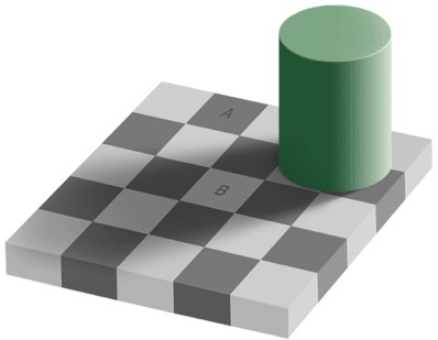
For examples of things being compared as such, take this optical illusion. Squares A and B are actually the exact same shade. #787878
Image
The proof.

Want a more extreme example?
Image
Believe it or not, the blue and green spirals you think you see are actually exactly the same colour. #00ff96
I opened it up in Photoshop to check it myself: Seriously.
Even with the colour bar added, it's hard for the mind to believe.

Art is affected by this, and it takes some serious practice to get out of it - but doing it does help the end results.
...and I don't pretend I did a brilliant job on the adjustment. I wasn't about to spend ages on something I could reasonably be asked to take down.
Does that thing kinda look like a big cat to you?
User avatar
Moonbogg
Staff Sergeant 3
Staff Sergeant 3
United States of America
Posts: 1734
Joined: Mon Oct 13, 2008 10:20 pm
Location: SoCal
Has thanked: 163 times
Been thanked: 100 times

Thu Jul 09, 2009 10:29 am

Whoa...I really like the contrasted version! It just brings it to life. The original is still good because it has that whole "original" thing going for it, but the modified version looks like he's about to jump out of the screen at you! Good job with the photoshop and good point on contrast. It may have been darker years ago actually. It has been laying around for over 10 years without any plastic cover or anything.
User avatar
Technician1002
Captain
Captain
Posts: 5189
Joined: Sat Apr 04, 2009 11:10 am

Thu Jul 09, 2009 11:36 am

Moonbogg wrote:Whoa...I really like the contrasted version! It just brings it to life. The original is still good because it has that whole "original" thing going for it, but the modified version looks like he's about to jump out of the screen at you! Good job with the photoshop and good point on contrast. It may have been darker years ago actually. It has been laying around for over 10 years without any plastic cover or anything.
I like it too. Excellent drawing. Charcoal is a darker color than carbon graphite which is why it is popular with sketch artists.

As a general rule as pencil is carbon graphite, it doesn't break down over time, and thus not fade. Faded pencil sketches are perceived as faded as the paper darkens over time reducing the contrast. Compare the paper next to a brand new sheet of printer paper. Moonbogg, just to either blow my theory out of the water or confirm it, please rescan one of the drawings with a piece of modern paper laying on top for a shade comparison.

I have theories all the time. I like to check them for validity. I do learn from my mistakes and try to learn from other's mistakes so I don't have to repeat them.
User avatar
Ragnarok
Captain
Captain
Posts: 5401
Joined: Tue Dec 19, 2006 8:23 am
Location: The UK

Thu Jul 09, 2009 7:55 pm

Moonbogg wrote:Whoa...I really like the contrasted version! It just brings it to life. The original is still good because it has that whole "original" thing going for it, but the modified version looks like he's about to jump out of the screen at you!
Of course, the original image is important, and it has an appeal simply because of being what it is, but there is something to be said for the reasonable use of post-production. Partly because conversion to digital never seems to do the real life work justice, but partly simply to make it look as good as possible in its digital form.

I would prefer not to have to "cheat" in Photoshop to any great degree, partly because most of the time I will be looking at the real world original, and there's no point in digital alteration if you're not going to see it.
It is good for mundane things though, like fixing digital photographs - I used Photoshop a while back to remove some lampposts and power lines from an image.
Good job with the photoshop
It wasn't really sophisticated work, just a levels tweak and use of the dodge tool on the background. I tend to do modest amounts of this stuff to everything I do, so I've got a certain amount of practice, simple though it is to master.
Technician1002 wrote:Faded pencil sketches are perceived as faded as the paper darkens over time reducing the contrast.
There is the potential that without fixatives and if handled, some of the graphite is transferred off of it, but the darkening of paper is some of the reason. It's part of the reason why I did further whitening of the background.

Alternatively, paper that's been drawn on (even if the newest of paper) is often just darker than fresh paper because the graphite can to get smudged onto "clean areas" as you work.

Some people do this smudging, some don't. Unfortunately for me, I'm one of the people that does. Fortunately for me, I'm also one of those people with the smarts to figure out a way of reducing the problem.
I give you the sock of doom: #1, #2 & #3. As the name suggests, it's an old sock which got subjected to the needlework needed to turn it into a glove - it's a good material to use for the purpose because it's thin and tight fitting.
The semi-fingerless design covers the fingers likely to drag on the page but doesn't hinder the fingers used for most drawing.

Not the neatest needlework, but function over form, and it works.
Does that thing kinda look like a big cat to you?
thedeathofall
Specialist 2
Specialist 2
Posts: 213
Joined: Tue May 06, 2008 10:43 pm

Fri Jul 10, 2009 6:27 pm

Wow... this thread is getting very interesting.

Rag, great work with what background you have. It looks fantastic and very real.

However, I would think that a long braid like that could get in the way... just a thought. I agree with you however, T&A is wouldn't be the best thing to do with frost. Not only to keep her realistic, but because she just wouldn't look good with it. (in my opinion)

The under armour just doesn't click for me though... it must be a personal opinion because I have never liked scalemaille. Its too fantasy for me i guess.

MoonBogg,

*applause applause*

Those portraits look stunning. Very realistic indeed. Again however, I agree with rag. More contrast is needed. I just spent 5 hours going through and sorting pictures from a memory card. My family sucks at taking pictures as I had to edit half just to tell what they were. It was mostly just brightness and contrast issues. But because of all that time i spent going through them, I took a look at your sketches and thought, "darker, more contrast". Its now become a habit:P
"I'm spending time without a gender for tax reasons. It's great if I get hit in the groin, but a total nightmare in the bathroom."

-Rag


Obsequium parit amicos; veritas parit odium.

-Cicero
User avatar
Ragnarok
Captain
Captain
Posts: 5401
Joined: Tue Dec 19, 2006 8:23 am
Location: The UK

Fri Jul 10, 2009 9:33 pm

thedeathofall wrote:Great work with what background you have. It looks fantastic and very real.
The background is an interesting revelation for me. While in most of my recent art, I've not really had my characters anywhere, adding the background really seems to add life, and I didn't expect how much.
It was something I really should have known, because one of my favourite pieces from my early art works well because of the background Silva inhabits.

Evidently, more backgrounds are needed. Not for everything of course, only some things need it, and some would actually suffer for the addition of one, but there are clearly things where it's very appropriate.

Unfortunately however, it has a downside. When I close my eyes I can now only see little leaf shapes...
However, I would think that a long braid like that could get in the way... just a thought.
Something I very much know. But there IS a reason for it.

If this were entirely realistic, she'd probably have hair barely longer than it needed to be - probably shorter than my hair is at the moment (especially at the full moon), but then again I do need a haircut.
She'd have nothing to get in the way or for people to potentially use as a handhold.

However, this is not reality, it's art. Given the high degree of gender specificness in hair, giving her short hair (typically masculine) could create ambiguity as to her sex.
Also, if I were following that rule, most of my female characters would have short hair. I don't want all my characters with identical design elements, so I don't let myself consider a character's hairstyle from a practicality viewpoint.

The last point is that Frost's armour is form fitting. While with other characters, their clothing can be used to suggest movement, I can't do that with Frost. But long hair makes a good substitute.
Silva's hair and grenade pin necklace, as well as the unfortunate's hair, shirt and bootlaces were useful for a suggestion of movement back in Excessive Force, and that's something that Frost's hair is there to try and help with.
I agree with you however, T&A is wouldn't be the best thing to do with Frost. Not only to keep her realistic, but because she just wouldn't look good with it.
It would also look ridiculous alongside my other characters if the shortest one had boobs three times the size of any of the others.
As far as height goes, Frost is a hair over 5' tall, while Silva is 5' 11" - and over twice Frost's weight. Bionics are heavy.

It's a little disappointing that it's a cliché where realism is a subversion, but that's the way it is.
I'm going with sensible because it's what I like, and the unsensible alternative may alienate people. Not that my art is likely to have many female fans, but no reason to discount that possibility.
... because I have never liked scalemaille. Its too fantasy for me i guess.
Try looking up Dragon Skin, one of the best modern body armours. It uses larger plates, but it's that kind of principle.

Either way, that's the look I chose for Frost, and I like it, which is probably the most important thing, given I'm the "client" for the work (I'm a harsh boss and an incompetent worker. I blame the poor pay rates.)
Besides, Warhammer 40,000 is often better described as "Science Fantasy" anyway.
Does that thing kinda look like a big cat to you?
User avatar
spudtyrrant
Corporal
Corporal
United States of America
Posts: 550
Joined: Fri Jan 02, 2009 6:10 pm

Fri Jul 10, 2009 9:42 pm

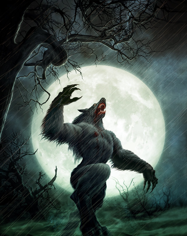
hey look i found one of rag's moon induced self portraits:
Image
i'm sorry please don't shred me lol
User avatar
Ragnarok
Captain
Captain
Posts: 5401
Joined: Tue Dec 19, 2006 8:23 am
Location: The UK

Sat Jul 11, 2009 12:19 pm

spudtyrrant wrote:hey look i found one of rag's moon induced self portraits
I wish. I'm not half that good at art.
Does that thing kinda look like a big cat to you?
User avatar
Ragnarok
Captain
Captain
Posts: 5401
Joined: Tue Dec 19, 2006 8:23 am
Location: The UK

Sun Jul 12, 2009 10:09 am

Not an update on Frost, but some of my art anyway.

This one is something for a Warhammer 40,000 based art forum's Weekly Challenge:
http://ragnarokeotw.deviantart.com/art/ ... -129215340
Does that thing kinda look like a big cat to you?
Post Reply